It has already been over 20 years since the Nintendo 64 was the latest offering from the company. In 2001, the N64 was on its way out while its successor, the GameCube, prepped for launch. Just before hanging its hat, the N64 got out one final swan song in the form of Paper Mario. Originally created as a follow-up to the Super Nintendo's Super Mario RPG, it morphed into its own thing and launched an entirely new sub-franchise.
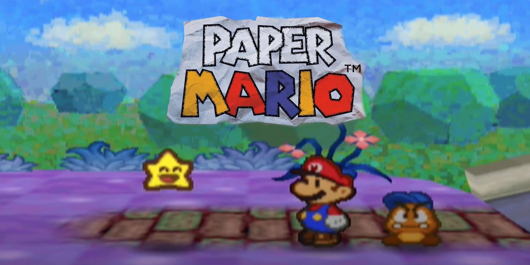
The game is often applauded for its charming story and enjoyable gameplay, but what is arguably the true star of the show is the art design in the original Paper Mario. While other games from the era have shown their age visually, Paper Mario has aged gracefully thanks to its commitment to a specific aesthetic. For a game that is over 20 years old to still look good, even in the wake of new systems, proves why it's as important to have strong art direction as it is to push the amount of polygons on screen.
Paper Mario's Timeless Appearance
While the Nintendo 64 may have been cutting edge at the time, games that were once graphical stunners like Perfect Dark have been overshadowed by those that followed over the years. Naturally, with each new console generation the power inside each machine makes way for more impressive technical capabilities. However, as beautiful as these games can be when they first hit shelves, it's a superficial strength that will likely become a victim to the passage of time.
While something like Uncharted: Drake's Fortune in 2007 has since been overshadowed in terms of pushing realistic graphics, Paper Mario maintains an authentic style all its own. The choice to commit to a storybook appearance with all its characters and locations having a paper or cardboard look has helped the game stand on its own.
It's a simple design choice, but one that has paid off in a big way. While even the most critically acclaimed N64 games like Super Mario 64 and Ocarina of Time are often poked fun at for their now-blocky 3D graphics, Paper Mario is spared from these same comparisons thanks to its timeless art direction.
The Importance of Strong Art Direction in Gaming
Paper Mario (as well as its sequels) are not the only games to exemplify the importance of strong art direction in gaming. This is not to say that pushing boundaries and breaking new ground in graphical prowess isn't important; making new discoveries for what can be achieved with the latest gaming tech is important and can yield some truly magnificent results, as evident in titles like Assassin's Creed: Valhalla.
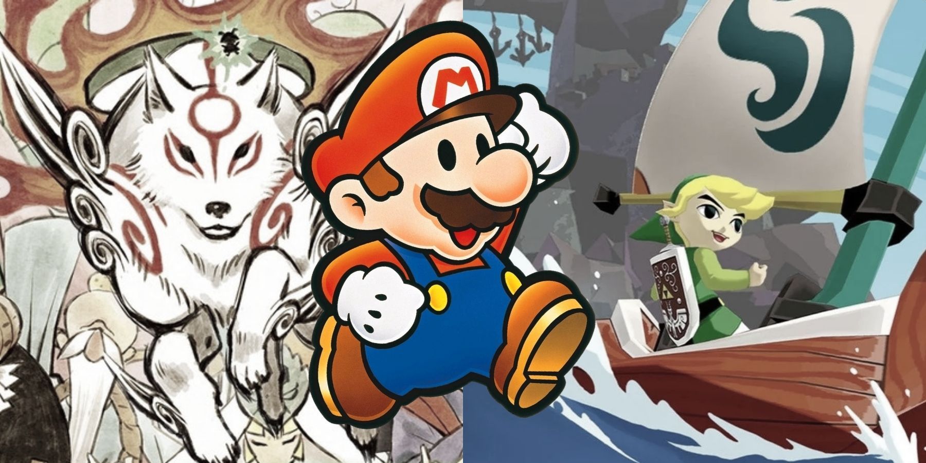
But there is a balance that must be found in order for a game to not be disregarded in just a few years. In 2002, the year after Paper Mario, Nintendo released another standout title in The Legend of Zelda: The Wind Waker. Despite receiving an initial backlash for its more cartoonish visuals, Wind Waker has been remembered as one of the most stunning entries in the franchise. This is especially evident in the 2014 Wii U remaster, which used some slight enhancements and made a 12-year-old game look as timeless as ever.
This can be seen outside of Nintendo titles as well, with some Capcom releases like Viewtiful Joe and Okami boasting particularly gorgeous visual designs. The latter game has been ported numerous times over the generations and continues to be praised for its painted aesthetic. The leaps and bounds made with graphics as seen in Unreal Engine 5 projects are certainly important, but the value of strong art direction is worth taking note of as well.
Paper Mario is available on N64, and is also playable via Nintendo Switch Online + Expansion Pack.


