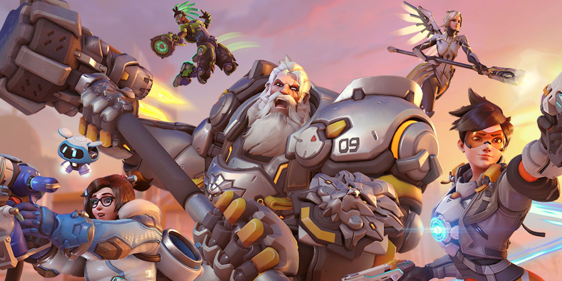
With the launch of Overwatch 2's PvP beta only a month away, fans of Activision Blizzard's massively popular hero shooter have been treated with plenty of teasers and sneak previews of the highly-anticipated game. Blizzard announced that the Overwatch sequel would see some significant changes to members of the first game's roster, with characters like Doomfist announced to be reworked into a tank. Plenty of new heavily requested features like an in-depth ping system, major quality of life changes, and more have also been highlighted. However, not every change has been met with glowing reception from the game's passionate fans.
Alongside the slew of gameplay changes coming to Overwatch 2, Blizzard has already announced several stylistic and design choices that will look to help the game to stand apart from its predecessor. Previous leaks have revealed redesigns coming to many of Overwatch's most popular Heroes, with Soldier 76, Zarya, and Sigma among others all getting new looks for the new game. While many of these changes have been popular among fans, with characters like Hanzo and Zenyatta seeing positive reception, visual changes to the game's HUD have been a controversial subject among fans of the franchise.
Why Overwatch 2's HUD is Being Criticized
With Blizzard continuing to release more information about the upcoming game, fans have been critical of many aspects of Overwatch 2's UI when compared to the original game's HUD. The segmented bright yellow styling of the first game's ultimate bar has been largely toned down for Overwatch 2, with the sequel's displayed as a simple dark-orange bar without much of the visual flair of Overwatch's. Icons for many Hero abilities have also been largely simplified, with their color schemes changed. Both aspects have drawn significant backlash from fans of the game.
Fans on the Overwatch subreddit were quick to criticize the redesigned HUD, with many feeling the icons and visuals lacked much of the visual flair of the first game. Many gamers in the replies of the post from Reddit user MorEdel compared the simplified style to many modern minimalist rebrands, with others feeling the changes may have been to optimize Overwatch 2 for mobile devices. While reception was largely negative, some fans in the comments of the post added that changes to the icons may be related to readability and visual clarity during a fast-paced match.
While Overwatch 2 has seen numerous delays since its first reveal at Blizzcon 2019, the long-awaited sequel looks to be getting its development back on track. Overwatch 2's first closed beta is set to debut next month on April 26th, and the game's largest competitive circuit, the Overwatch League, has confirmed its upcoming fifth season will be played on an early build of Overwatch 2. While Overwatch may not be the juggernaut of the gaming world it once was, Overwatch 2 should look to inject some fresh energy into the franchise when it eventually releases.
Overwatch 2 is in development.


