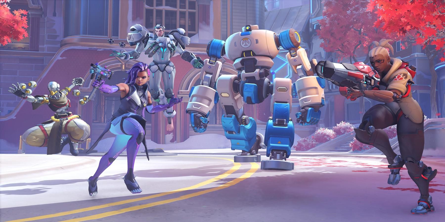
Thus far, the hero redesigns for Overwatch 2 are proving to be a mixed bag. While the idea of giving every hero an updated look to indicate that time has passed is a good idea, not all of the changes have been received well. For every unanimously praised design like Sombra or Widowmaker, there seems to be something like the Cassidy redesign that sparks controversy.
The latest Overwatch 2 designs have continued the trend, with the community seemingly split on the new looks once again. The new attires for Zeyatta and Hanzo are receiving near unanimous praise, for example, but the changes to Sigma and Brigitte are coming under fire. While not everyone dislikes the looks, several fans have shared why they are not into the adjustments, and these responses are worth highlighting since they seemingly showcase a trend.
Unnecessary Changes in Brigitte’s Overwatch 2 Redesign
A clear example of the negative reaction can be seen in a post about the Brigitte redesign from Tohoku123, who points out the change in hair and eyebrow color for Brigitte. While this may just be a change caused by lighting, the adjustment does seem significant. As pointed out by Frosty_Plate03, a bigger potential downside is that the hero’s unique hairstyle has been swapped for a generic ponytail.
In the original Overwatch, Reinhardt’s squire boasts a ponytail, but she has two strands of hair that come down the sides of her face. This makes for a unique look that sets her apart from other characters, with a tiara-like headpiece present in the first design as well. This is gone with the new looks, with many fans like CozyPine pointing out that they miss this touch. To many, these subtle differences make Brigitte’s look in Overwatch seem oversimplified compared to what she had before.
A Loss of Personality in Sigma’s Overwatch 2 Redesign
A separate Overwatch post from Reddit user nnickttrusty saw players touching on Sigma’s redesign. Players like intelligentimbicile argue that it swaps its experiment aesthetic for something more soldier-like, though this could tie-in to the lore with Doomfist bringing Sigma into Talon. A more common complaint is pointed out by haydnc95, and it deals with a loss of color.
The Redditor compares the situation to Baptiste's redesign, another divisive design that saw the healer’s orange color swapped for white. While the mohawk is a nice enough change that adds some style, many feel that the swap to white makes for an uninteresting look. Now, the same thing has happened with Sigma, with the green from his original attire completely removed in favor of an all-white appearance. Aside from players seeing the lack of color as bland, some, like MONO-NINJA, simply think the updated armor is “ugly.”
On the bright side, there are plenty of Overwatch cosmetics for each hero, so those that dislike some of the new designs will not have to use them if they do not want to. Still, there does seem to be a general trend where the redesigns are removing color and certain aspects of each hero are being simplified. With these kinds of changes being criticized consistently, Blizzard may want to take the feedback into consideration when crafting the rest of the roster’s new looks.
Overwatch 2 is in development for PC, PS4, Switch, and Xbox One.


