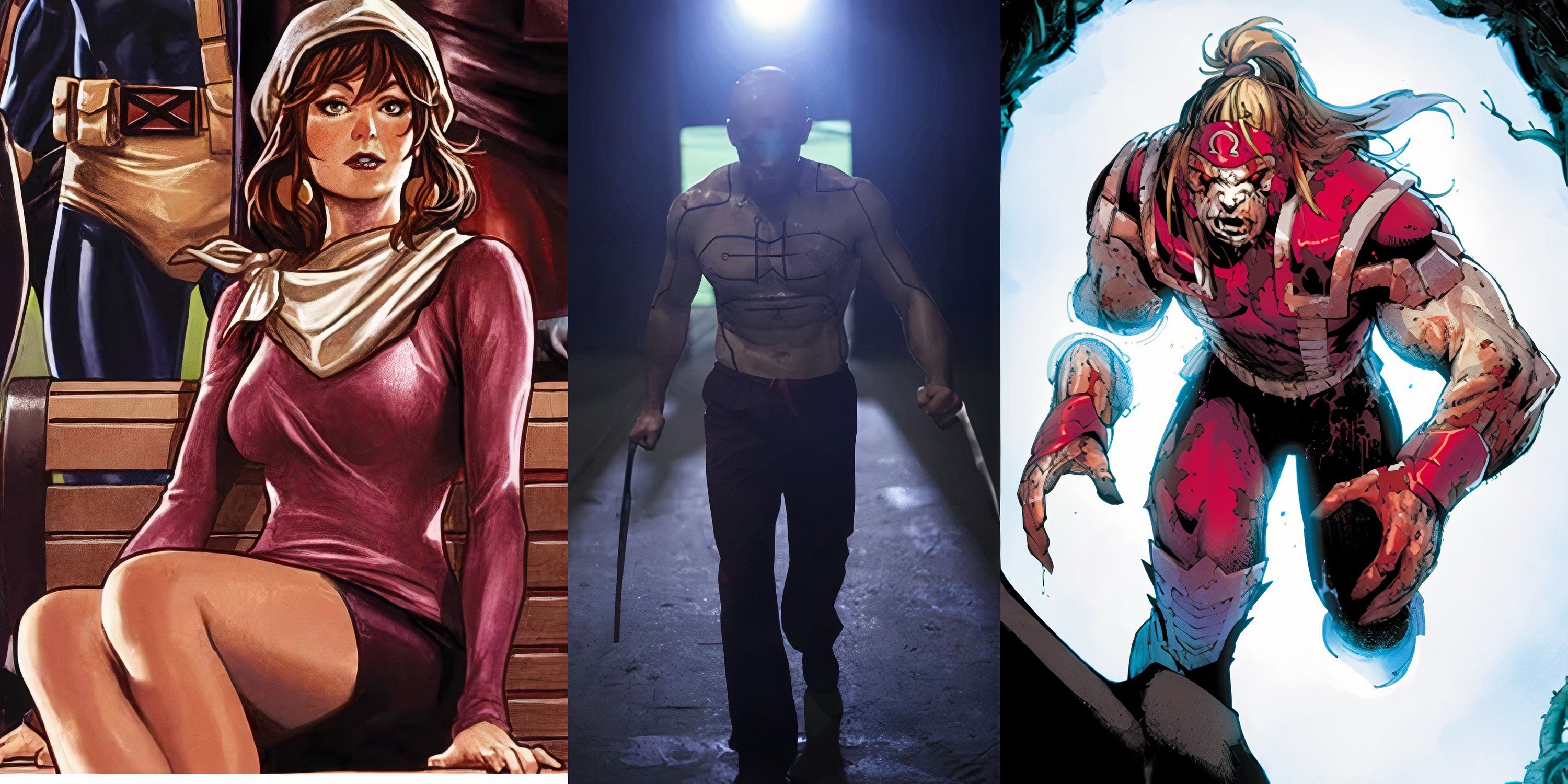
In all adaptations, changes are necessary to better fit the medium a series is transitioning to. This, however, doesn’t stop fans of these series from objecting to many of the changes made. While this discontent can sometimes get out of hand, sometimes this backlash is well deserved.
In an adaptation project as large scale as the MCU, many of these shortcomings have come over the years. Particularly, when it comes to adapting Marvel’s iconic character designs to a live-action environment. While most characters see faithful renditions of their original looks, there is no shortage of botched redesigns that make fans groan.
10 Mr.Fantastic
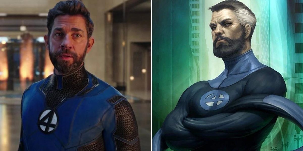
While Reed Richards and the rest of the Fantastic Four aren’t in the MCU proper yet, he was given an on-screen appearance in one of Doctor Strange in the Multiverse of Madness’ alternate universes, giving fans an idea of how the MCU would approach the iconic team’s designs.
While the suit retains much of the main aspects the Fantastic Four suits are known for, it ends up adding just too much unnecessary detail. Particularly, the black panels on his arms break up the blue of the suit a bit too much and make it look more cluttered than in previous incarnations.
9 Ant-Man
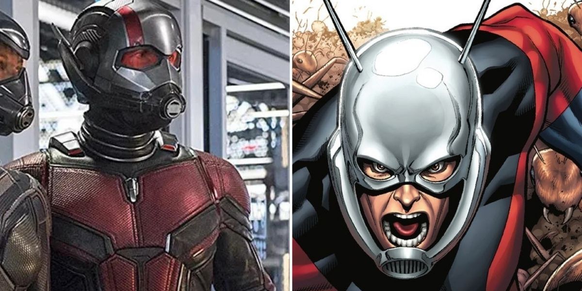
Ant-Man has suffered many changes from the comics that many aren’t fond of. The most noticeable change was the choice to forgo Hank Pym as the main Ant-Man in favor of Scott Lang. Even for those who could get past this, the many changes to his suit are also a point of contention.
Not only was the blue on his outfit completely removed, but the prominent reds were also turned down intensely. Looking at his helmet specifically, not only does he lose the on-brand ant antennae, but also gains a fully covered mouth that limits his ability to properly emote.
8 Wasp
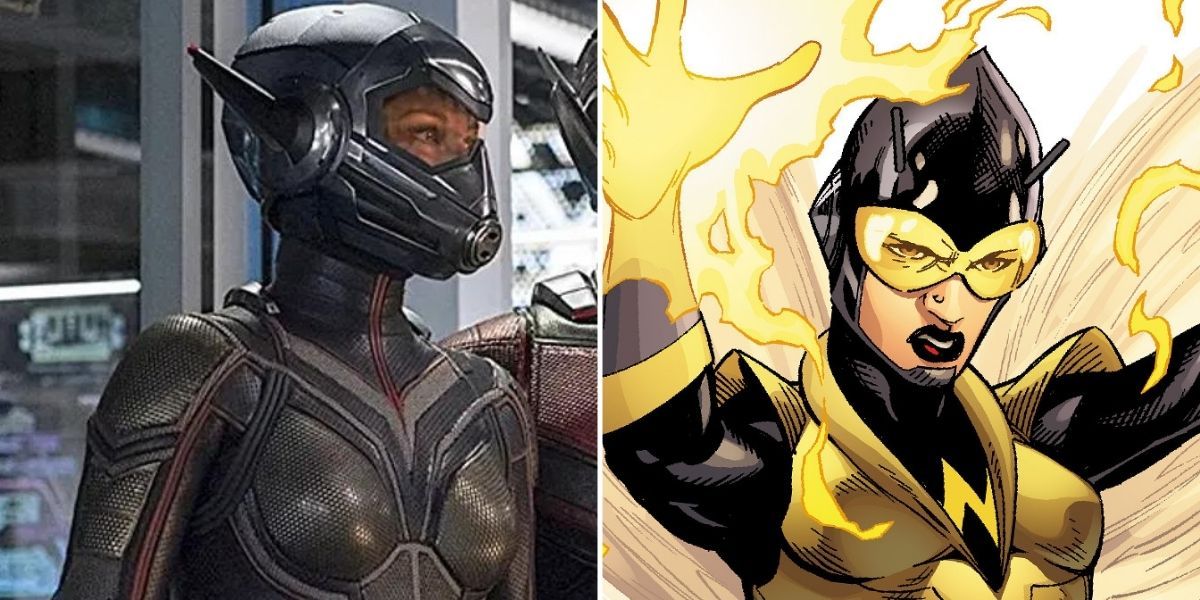
Much of the Wasp’s changes in the MCU are similar to those made to Ant-Man. Instead of Janet Van-Dyne, the original Wasp in the comics, the role was given to her and Hank Pym’s daughter, Hope. Although many would have preferred to see Janet in action, this change is less objectionable than the change from Pym to Lang.
Her suit shares all the same issues as Lang’s suit though. A lot of MCU suits tone down the comic’s colors, but Wasp’s suit overdoes it and ends up with far too little yellow. Her closed helmet also restricts her capacity to emote just like Lang’s.
7 Captain Marvel
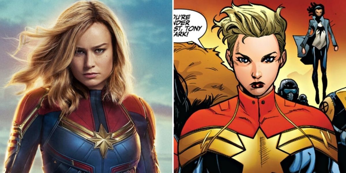
It must be stated that as far as casting goes, Brie Larson does a great job portraying Carol Danvers on screen. Her suit is also on the better end of MCU suits but still falls short of her comic counterpart.
While the MCU suit has a neat feature of being able to change color at a whim, the comic suit’s simplicity ends up being far more appealing. Particularly, it’s a shame the MCU suit got rid of the waist scarf that added a nice flair to the general outfit, as well as helped her silhouette read better from a distance.
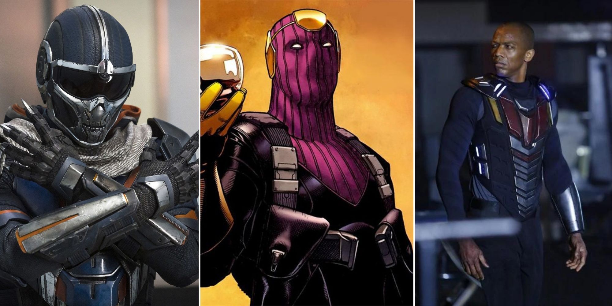
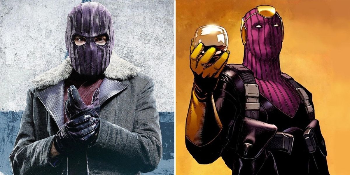
6 Baron Zemo
Marvel’s villains feature some of the least live-action-friendly designs in the comic universe. Baron Zemo however, isn’t exactly one of them. His full suit is a bit much for the MCU, but his general color scheme and theming should have been fairly easy to adapt.
Somehow though, when Zemo first appeared in Captain America: Civil War, he was completely devoid of any suit at all. Even when The Falcon and The Winter Soldier eventually gave him some semblance of his original suit, it just didn’t live up to it in any way.
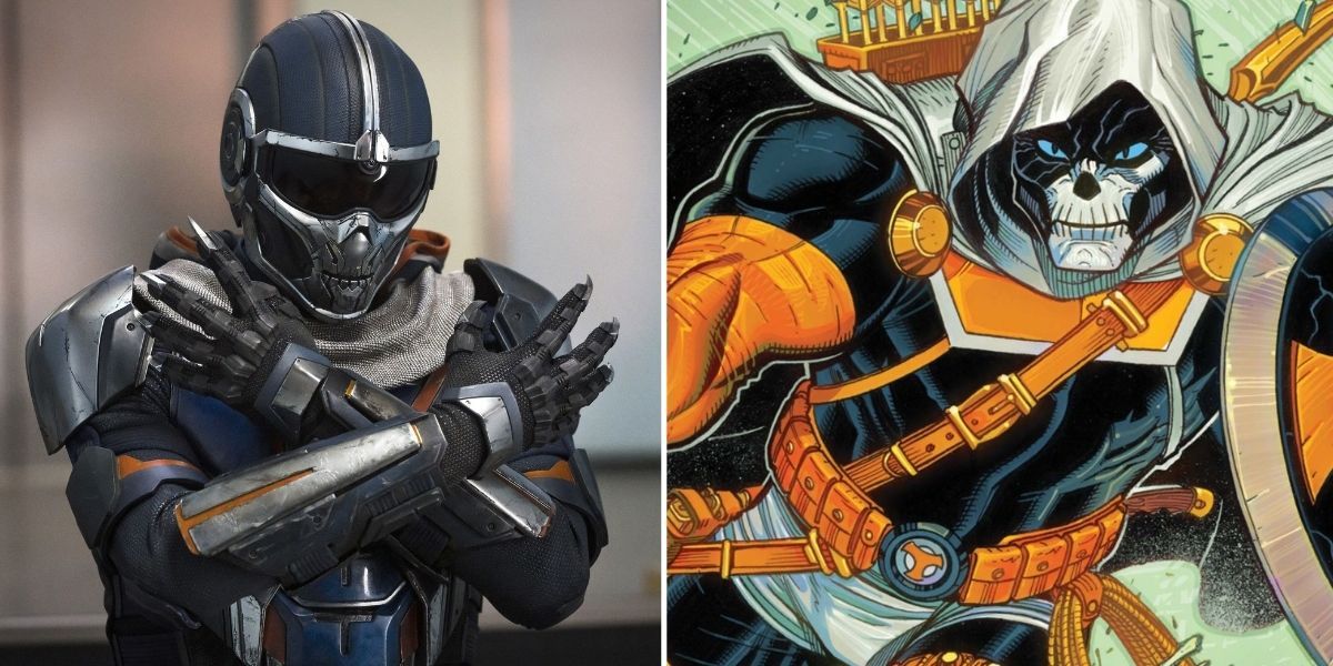
5 Taskmaster
Taskmaster’s case is particularly frustrating, as Insomniac’s Spiderman game recently provided a good template for how the move-stealing mercenary could work in a more realistic environment. Instead, Black Widow revealed a much less impressive version of the character.
While the movies might not have been able to capture the full skeleton-faced design from the comics, the cheap bicycle helmet they used doesn’t even come close. It also dulls the whites into dull grays, completely throwing off his original color scheme.
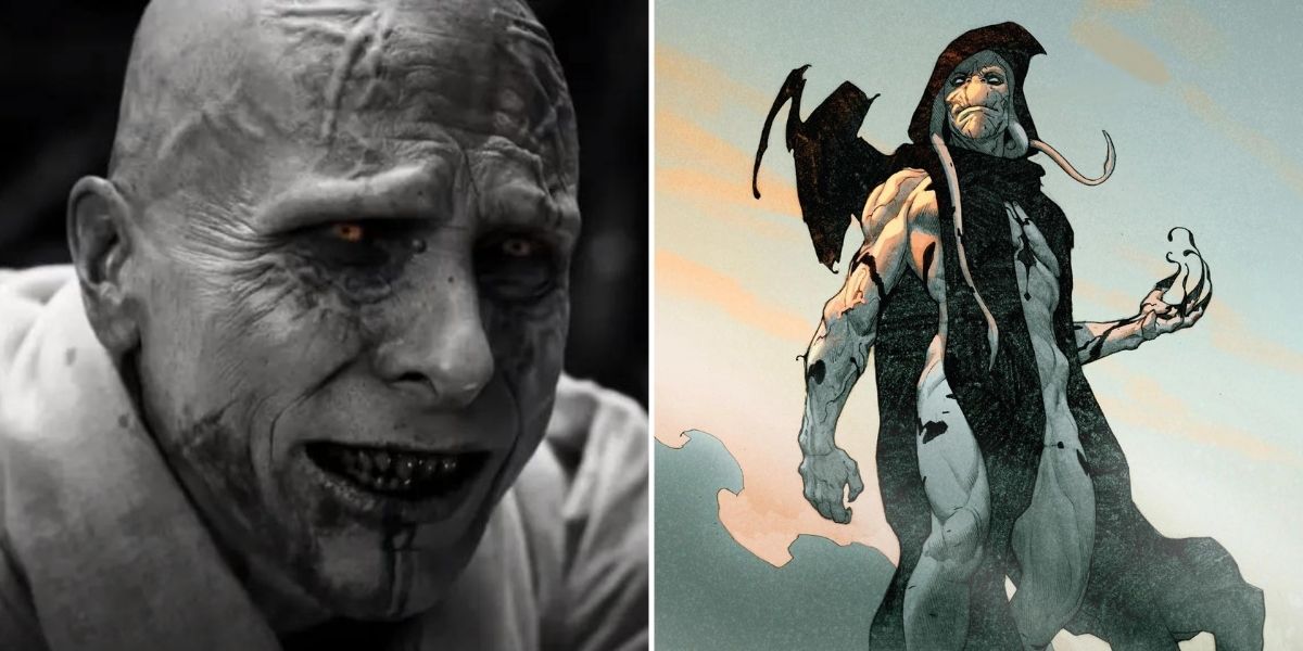
4 Gorr The God Butcher
The latest villain to make the transition into the MCU, the reveal of Christian Bale’s Gorr in Thor: Love and Thunder instantly came with apprehension from fans due to the drastic differences in the god-hunting alien’s appearance.
The most noticeable changes are the lack of Gorr’s distinctly alien features. His long head protrusions are nowhere to be found, and Bale is given no prosthetics to make his face appear less human. The original’s black robes are also swapped out for almost grecian white ones. In general, the MCU design fails to even read as alien, let alone genuinely imposing.
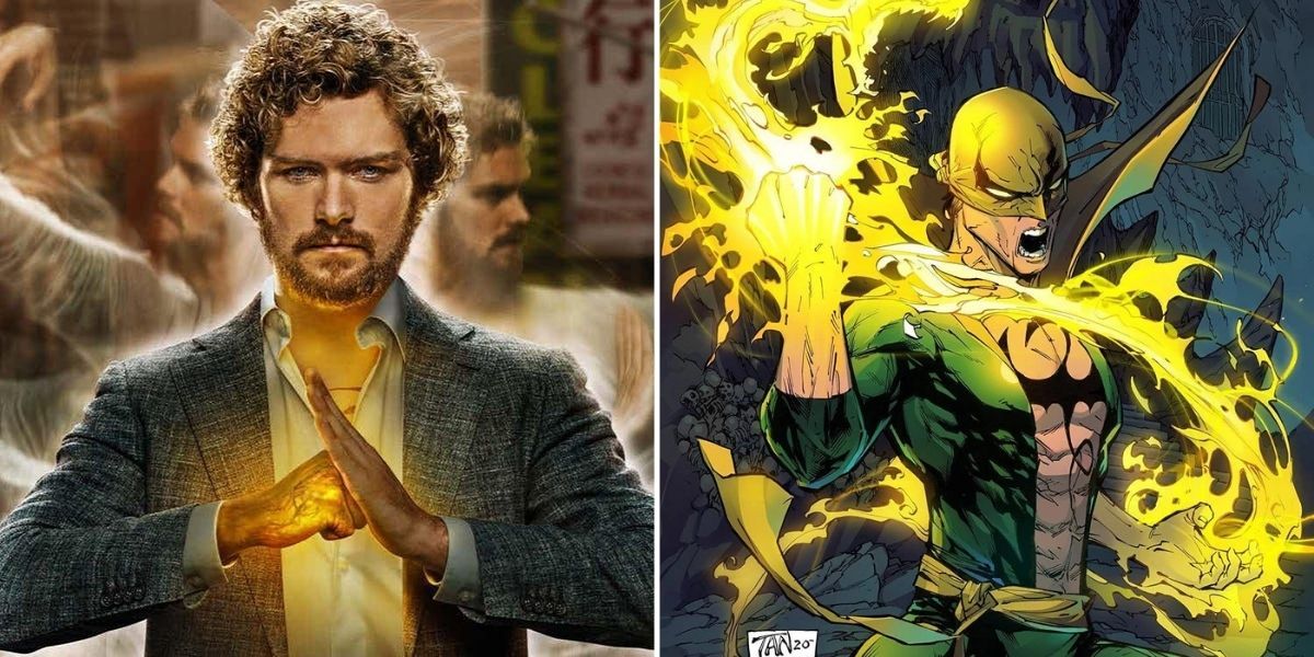
3 Iron Fist
Iron fist is an interesting case, as the original comic design has barely even been attempted in the MCU. His only appearances have been in the Iron Fist, Luke Cage, and Defenders shows, in which many felt the character was poorly portrayed and hard to like.
While he possesses the iconic dragon tattoo on his chest, the MCU’s Iron Fist lacks anything that can even be called a suit or hero design, as he mostly operates in casual clothes. While the comic design definitely needed some adaptation, it’s sad that the shows never gave it a solid try.
2 Malekith
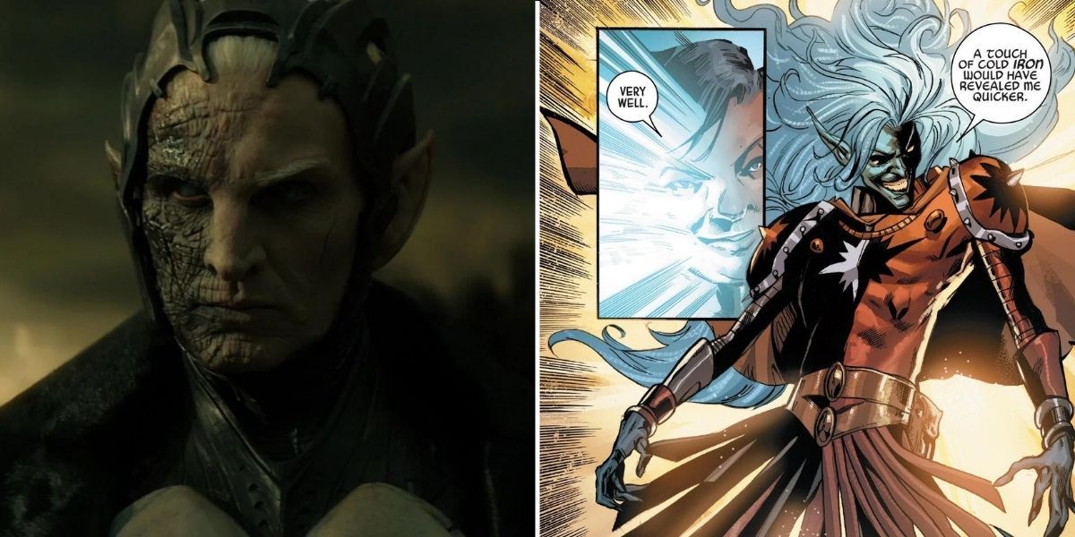
As the main villain of what many consider to be the worst Thor movie, Malekith’s MCU incarnation is marred in unfortunate decisions. While he suffered from the forgettable nature of Thor 2, his design change is a true tragedy.
Comic Malekith has a lot going for him design-wise. The two-toned face and clothes are instantly striking and memorable and sell his mischievous jester-like personality. In the MCU however, not only is he stripped of his wilder personality but he is also resigned to a boring, gray and black design with none of the flair of his original look.
1 Deathlok
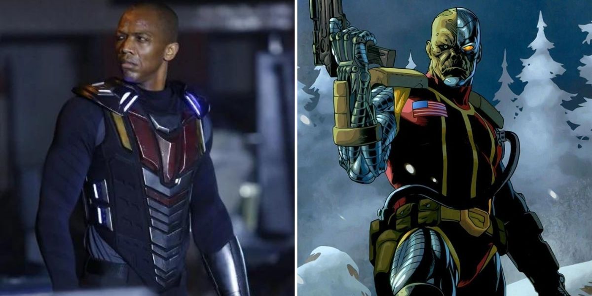
Deathlok is another case where it feels hard to argue that the design wasn’t phoned in. He only appears in Agents of S.H.I.E.L.D, and rightly so, as anyone who takes a look at his comic version can instantly tell how far the MCU strayed in his portrayal.
While the original has similarities to DC’s Cyborg and other half man/half machine characters in fiction, the MCU version could be mistaken for a regular person by an outside observer. His half-robotic face isn’t even attempted, and his other robotic limbs are toned down far too much. This is one case where it’s genuinely questionable what happened in the planning room to let this design reach the final product.

