Marvel’s ongoing cinematic universe has earned much ire over the years for its treatment of beloved comic book characters. Live action adaptations in general have a bad reputation for butchering character designs, personalities, and storylines.
While the negativity can seem overwhelming at times, there is much the MCU has done to live up to the legacy of the characters it adapts. Particularly, it has given many characters much-needed updates to their costumes and general designs. These updates are mainly necessary for them to better fit into a live action environment, but sometimes end up being objective improvements to their comic book counterparts.
10 Rocket Raccoon
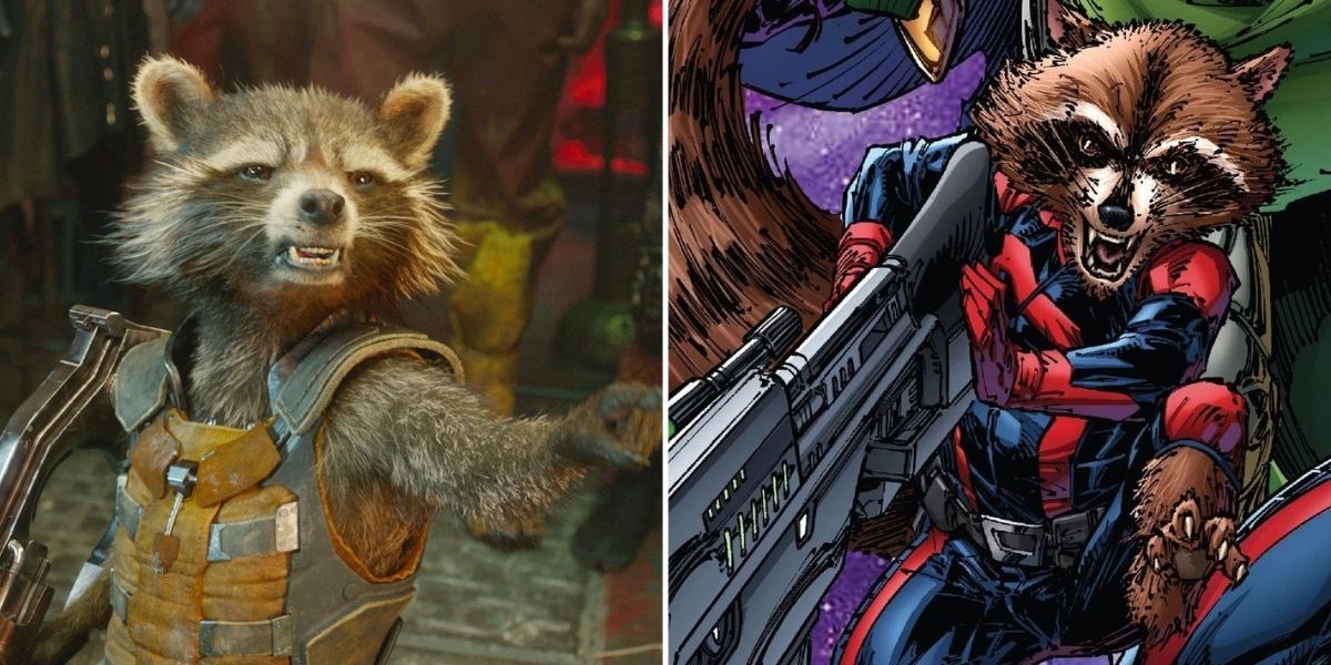
If it wasn’t for Groot, Rocket might be the most popular member of the Guardians of The Galaxy. The trash-talking trash bear doesn’t have much to change design-wise due to not being anywhere close to human looking, so for him, it’s all in the clothes.
His comic incarnation is most often seen in a uniform he shares with other guardians. So, the MCU introducing him and the rest of the team with widely different outfits helped sell their lack of cohesiveness in their first movie. Rocket’s orange jumpsuit also ends up looking more like the outfit of a scavenger, although he later receives an outfit more reminiscent of the comics.
9 Dr.Otto Octavius
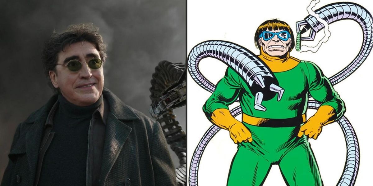
One of Spiderman’s most iconic villains, Otto Octavius originally wasn’t part of the MCU, but Alfred Molina’s rendition of the character was able to show up in Spiderman: No Way Home via one of the MCU’s ongoing multiverse storylines.
Marvel opted to retain the general design from Spiderman 2, forgoing the comic’s bright yellow and green outfit. As iconic as the classic suit is, the movie’s understated approach makes Octavius much more intimidating, playing up his confident criminal side over his spiteful scientist side. The rounded sunglasses especially, really help to sell the look.
8 The Mandarin
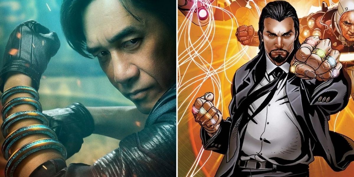
Iron Man 3 was technically the MCU’s first attempt at adapting the Mandarin character, but fans overwhelmingly rejected both the hapless actor pretending to be the Mandarin and the spiteful businessman who was really running the strings.
In Shang Chi and the Ten Rings, however, the character was reintroduced as an underground warlord and father of Shang Chi, Wen Wu. While one short scene features Wen Wu in classical Mandarin garb, for most of the film, his design is much more understated. Through the strength of Tony Leung’s portrayal and the redesigned ten rings though, this new version ends up being more of an imposing villain than the original.
7 Killmonger
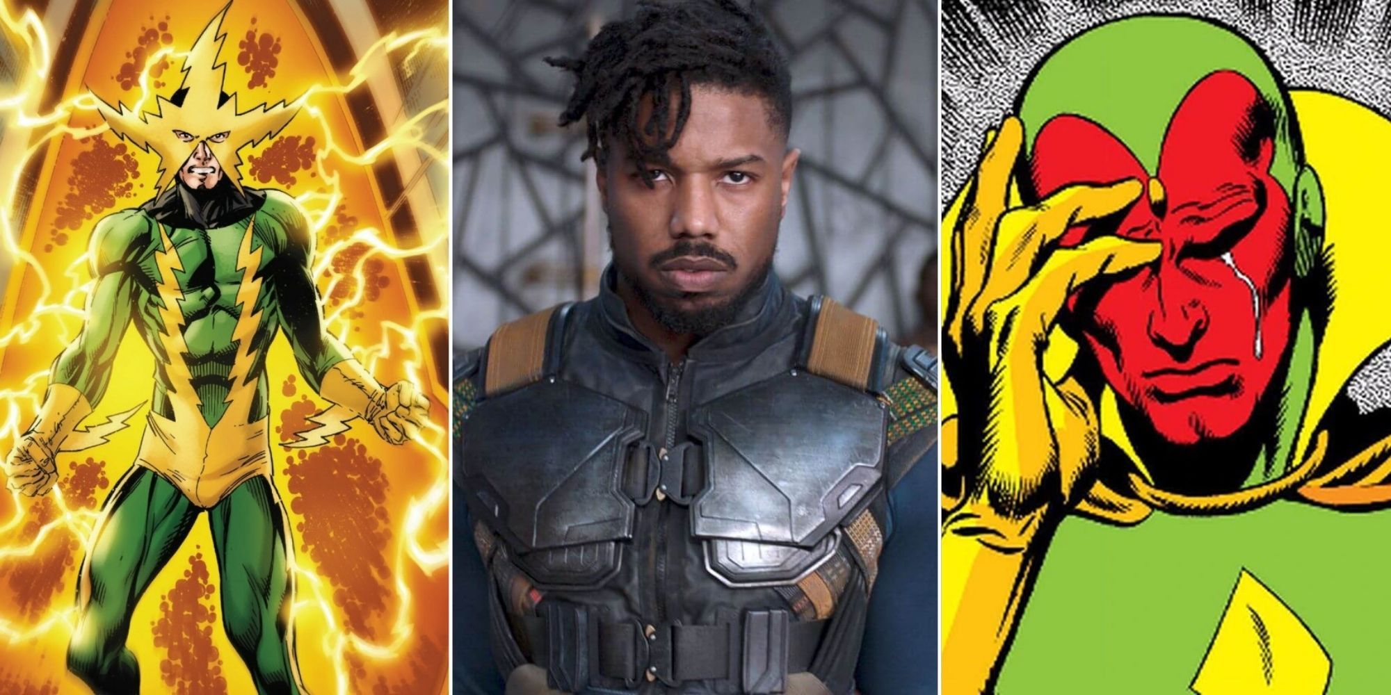
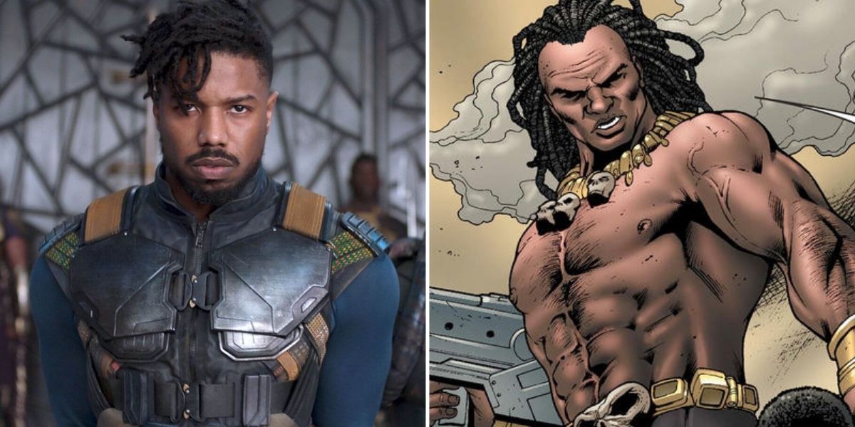
Michael B.Jordan managed to bring Killmonger to life almost as much as Robert Downey Jr. did for Tony Stark. Part of this achievement can be attributed to Jordan’s own influence on the character. His main outfit takes inspiration from Dragon Ball Z’s saiyan armor and ends up being just as iconic.
Even besides this look, the choice to use West African scarification for Jordan’s Killmonger made for an impactful reveal during Black Panther, and was a stroke of genius. As intimidating as the comic renditions of Killmonger are, Jordan’s portrayal just feels far more genuine in his personality, which makes him even more threatening as a villain.
6 Dr. Strange
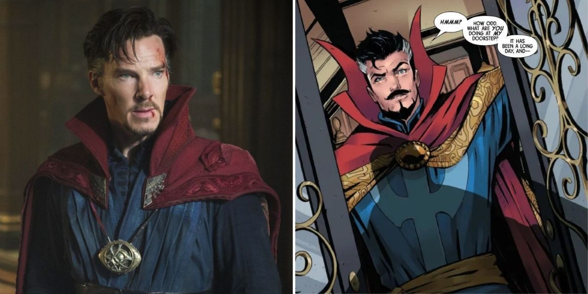
Dr. Strange has quickly risen to the top of the MCU since Avengers:Infinity War gave him a big role to play in the battle against Thanos. He’s also undergone some of the least design changes between MCU appearances, mostly sticking with the same robes from the original Doctor Strange film.
There are many noticeable changes between the MCU design and its comic counterpart though. For one, his sentient cape is far more understated, mostly sticking to different shades of red over the comics’ saturated red and yellow. While it’s not a significant improvement, the strategic toning down of his original robes help the character read more like a believable sorcerer.
5 Electro
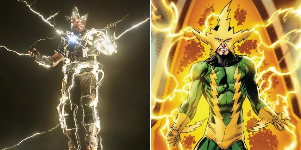
Similar to Dr. Octavius, Electro only appeared in the MCU from an alternate universe, particularly that of The Amazing Spiderman 2, where he was played by Jamie Foxx. Audiences rightfully mocked his bizarre design from the original film, but luckily the MCU changed his design up again for Spiderman: No Way Home.
In this new rendition, he does away with the blue skin and black suit but also avoids the comic’s yellow and green spandex. Instead, he wears more of a combat-ready outfit, with a collection of electric devices to help his powers. Especially when the electric star from the comic design is sparkling over his face, this ends up being a well-thought-out improvement over the original.
4 Vision
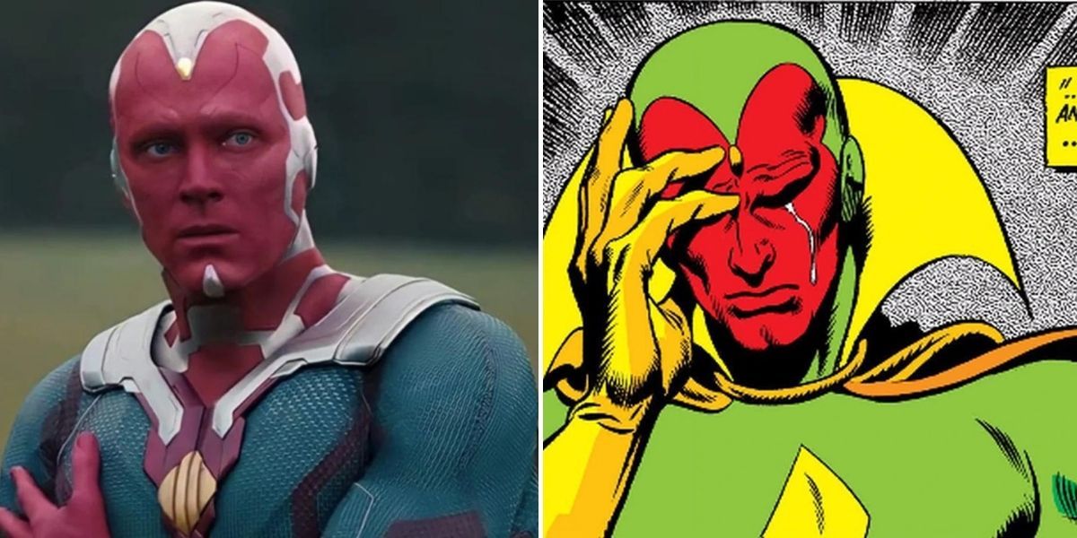
While Vision might not return to the MCU going forward, in the time he was around, he became a surprisingly likable character in the main cast. The decision to allow Paul Bettany (the voice of Jarvis) to keep the role as Jarvis transitioned to Vision is partly to thank for this.
The big boon for his MCU appearance is that it convincingly makes him look like the android he is. His comic appearance uses a lot of fabric and makes him look more like a normal human in a suit and red makeup. The MCU does pay homage to this original design but thankfully strays away from it for the most part.
3 Mysterio
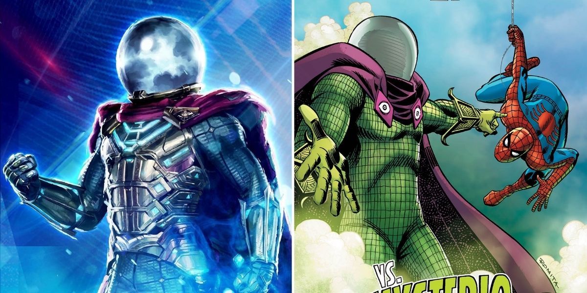
The original, comic book version of Mysterio was easily one of the characters least in need of drastic changes for a live action environment. His outfit is a lot less flashy than early comic designs tended to be, and has a more pleasing color scheme than Electro’s bright green and yellow.
Despite this, his appearance in Spiderman: Far From Home still manages to improve on the original. Mainly, the addition of a golden chest plate does a good job of breaking up the mostly one-piece suit and further enhances the color scheme. It’s strange to say, but the original design looks quite naked in comparison now.
2 Vulture
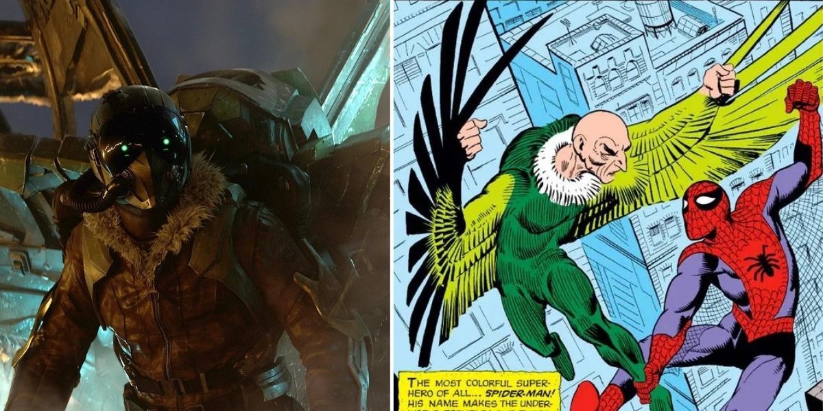
Yet another Spider-Man villain that was in need of some changes, Vulture was usually presented as an old, balding man in a skintight, green vulture suit. Even in the wackier world of the comics, this design has never been very strong or threatening.
There are many things about the MCU’s vulture that makes him arguably the best version of the character, and a big one is his new design. The vulture suit is reinterpreted as a mechanical attachment similar to Falcon’s wings, allowing it to not only look more realistic and grounded, but also quite large and threatening. When he descends he feels like a humanoid helicopter rather than a pigeon.
1 Yellowjacket
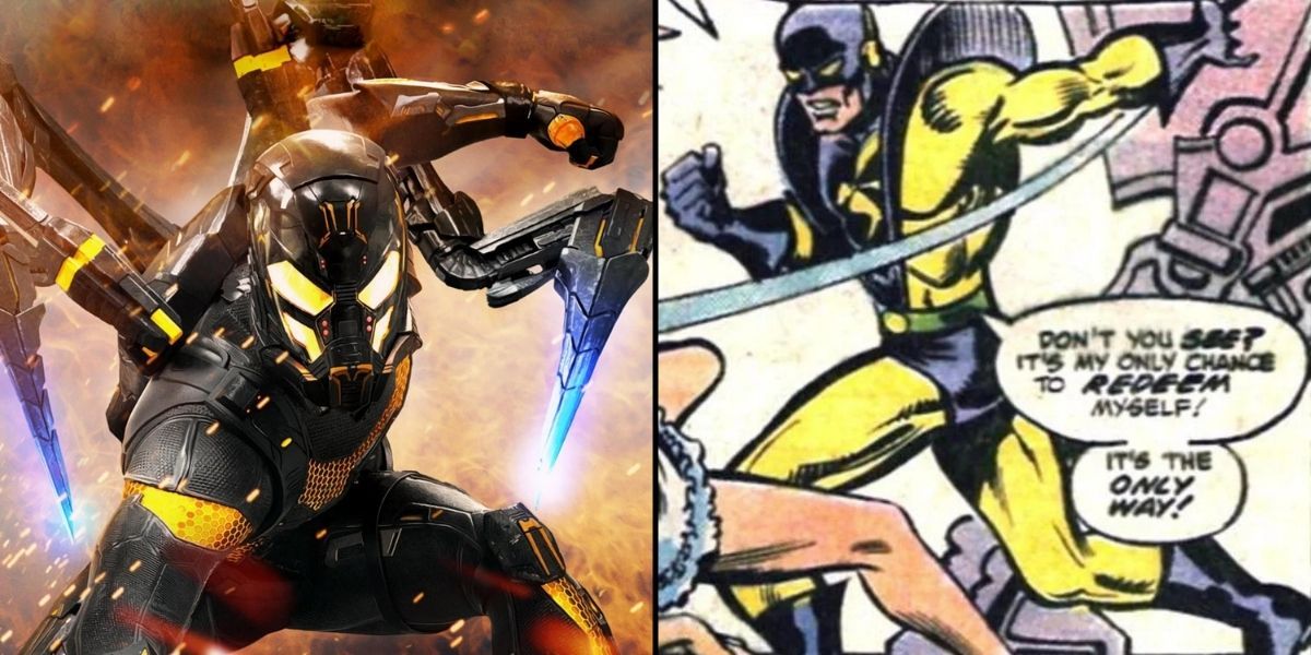
In the comics, Yellowjacket is a name mostly used by Rita DeMara, a female supervillain who stole her suit from Hank Pym. For his appearance in Ant-Man though, the MCU chose to retool the character Darren Cross into the role of Yellowjacket, giving him a mechanized suit similar to that of Ant-Man himself.
Not only does the MCU help tie the character to Ant-Man, its addition of mechanized arms better carries the insect motif. This new design of the character was so successful that it was later reintegrated into the mainline comics, which is a rare achievement for a live-action adaptation.

