


Highlights
- Nintendo's commitment to high-quality visuals is evident in all of their Legend of Zelda games, although some titles shine more than others in terms of visual polish and style.
- Games like Phantom Hourglass and Spirit Tracks, while based on the toony cel-shaded style of Wind Waker, lack the same magic and flourish in their environments.
- Each Zelda game contributes to the series' rich tapestry of art styles, from the original Legend of Zelda's pioneering visuals to Breath of the Wild's culmination of all previous styles, blending fantasy and technology.
Nintendo rarely (if ever) puts out a bad-looking game. The Legend of Zelda, being one of their most recognizable and successful franchises, is especially subject to the high bar of quality the company is known for.

The Legend Of Zelda: The Major Races Of Hyrule (And Beyond) Explained
The Legend of Zelda franchise has introduced fans to many memorable characters from a variety of races. Here's a breakdown of them.
But while every game is beautiful in its own way, some titles are polished with more splendor and majesty than others. In some cases, technology wins the day; in others, with style. Either way, each adds to the series' rich tapestry.
14 Phantom Hourglass / Spirit Tracks

Although the design of Phantom Hourglass and Spirit Tracks was based on the "toony" cel-shaded style of Wind Waker, unfortunately, they weren't brushed with the same magic. While character models look pretty good for a DS game, the environments lacked the flourish seen on the Gamecube classic.
Because of the lower resolution and lack of fine details, the painterly style leaves the rest of the world looking rather flat and uninspired, especially when compared with the charming character models.
13 Four Swords

The Four Swords series began as a multiplayer mode on the Game Boy Advance's interaction of A Link To The Past, then spun off into a game of its own on the Gamecube (Four Swords Adventures). The multiplayer experience for the classic SNES port was developed around the same time that a certain Gamecube hit was winning over fans with its colorful new style.
The result was A Link To The Past's art style blended into Wind Waker's cel-shaded "toony" look. Unfortunately, Four Swords looks caught in a muddle of two unrelated styles. Nintendo 2.5D-style games certainly have their appeal, but here, the brittle bits mar the smooth, whimsical quality of Wind Waker.
12 Gameboy Era

Although the three Zelda Gameboy games (four if DX is counted separately) were absolute bangers, the art style would have definitely felt like a step down from those who had played the SNES entry just a year earlier. Although they do the job fine, characters and enemies are much less expressive.

9 Genres The Legend Of Zelda Should Explore Next
Nintendo's The Legend of Zelda loves to innovate, and the games have a few new genres they can try out next.
The environments certainly have their charm, especially those in Oracle of Seasons, in which Link could change the seasons with a magical rod, pushing the limits of the Gameboy Color to its physical limits.
11 The Legend Of Zelda (Classic)

Sometimes, innovation is born from necessity. While it may not be much to look at today, the original Legend of Zelda did a lot of heavy lifting with its art style, and impressed 80s gamers far and wide with its flashing neon rupees and oddly stark desert pastels.
Far from being the first top-down adventure game, The Legend of Zelda codified most of the visual principles the series would be known for, especially for the 2D titles: rupees, enemy models, and the land of Hyrule all followed from the source.
10 Skyward Sword
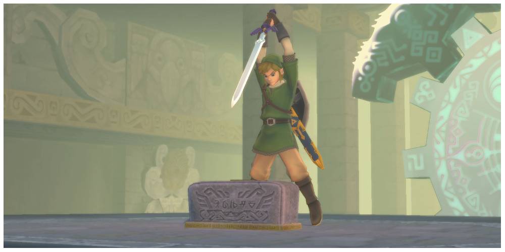
As with every Zelda entry by Nintendo, Skyward Sword meets a certain threshold for quality in terms of its looks. However, like the game itself, it does little to innovate from what fans of the series had seen before.
To some, Skyward Sword was simply a Twilight Princess with a more vibrant color pallet. There's nothing necessarily wrong with that, but it just didn't do much to push boundaries or stand out from an already stellar array of styles.
9 A Link Between Worlds

Getting a cohesive art style right in A Link Between Worlds would have been extra important, seeing as the game's selling point was the ability to "shift" into a hieroglyph while against walls. There are some amazing effects in A Link Between Worlds, and it has many excellent nods to its predecessor, A Link To The Past.
However, perhaps to provide contrast with the trippy 2D segments, the characters in the 3D world do look a little unrefined. This is perhaps because each sprite from A Link To The Past was modeled into 3D space, meaning that they lost some of their pixilated charm.
8 A Link To The Past

This was the title that launched a thousand pixilated dreams, and, arguably, where the series began shaping its iconic aesthetics in earnest. Characters are expressive in or out of cutscenes. The environments are luscious and vibrant, and the effects provide atmosphere and immersion with rain and fog.
As well as the starting point of great storytelling in the series, A Link To The Past was where Nintendo arguably mastered the top-down Zelda style and look with sprites and backdrops that are easy on the eye.
7 Twilight Princess
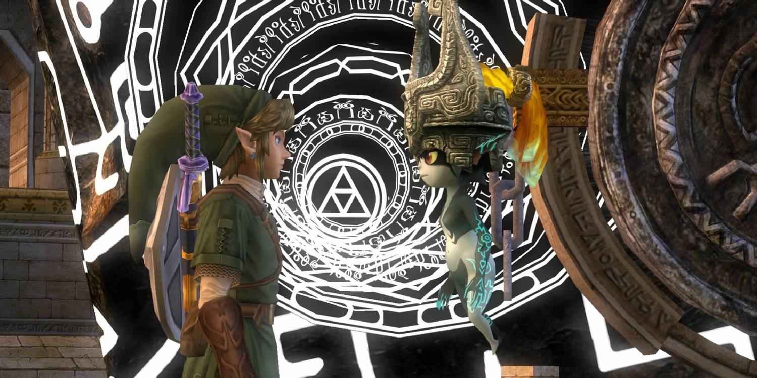
While Twilight Princess didn't exactly take a wild detour with fans' expectations, it did deliver what many had been waiting for years (since The Ocarina of Time days) for a mature, high-fidelity adult Link adventure.
The game took on a more serious look with its broody tones, especially during moments involving Twilight Beasts or the Twilight Realm. Compared to the previous, sea-faring adventure, the visuals can look a little washed out in parts. That being said, it managed to do the impossible and fulfill many fans' wildest Zelda dreams.
6 The Minish Cap
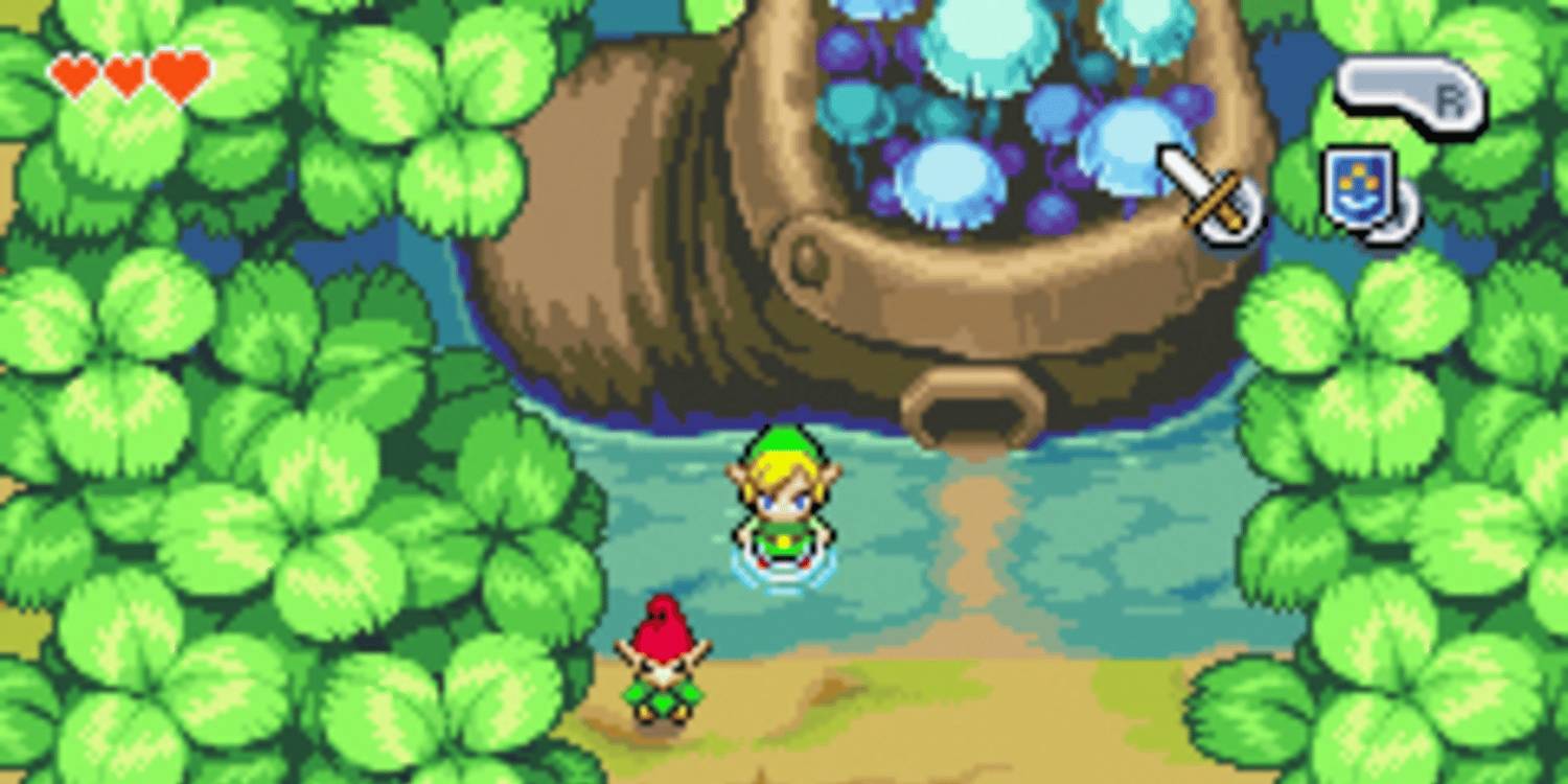
While other titles attempted to adapt the Wind Waker style to the classic SNES style, The Minish Cap finally managed to capture the fluid movements and flashy animations that made the first "cartoony" outing such a hit.
Link's ability to shrink down in size (smaller than a shoe!) probably prompted discussions in the developer's room about making the pixilated environment feel extra lush and detailed, which is exactly what fans got in this GBA classic.
5 The 3DS Remakes

Improved facial animations, more detailed textures, and impressive 3D special effects built on top of the originals' rock-solid art styles make the Ocarina of Time and Majora's Mask 3DS releases almost as timeless as the originals.
However, as faithful as these games are to the original, even with such painstakingly detailed beautification, it's undeniable that something is lost. An element of grittiness was lost that the N64 managed to capture (perhaps by accident), especially in the more somber and nightmarish of the two, Majora's Mask.
4 Ocarina Of Time / Majora's Mask

The N64 games set the standard for 3D Zelda entries, as Ocarina of Time managed to cultivate a sacred, rough, lush, or terrible atmosphere, and at some points, all simultaneously. Conversely, its twin (in more ways than one) managed to pump all that atmosphere with nightmare fuel.
If Ocarina managed to give players the same feeling a child gets being thrust into an adult world, Majora's Mask delivers the feeling of a child being thrust under the bed, where nightmares await.
3 Link's Awakening (Switch Remake)

The original Link's Awakening design was intended to be dreamlike, which is appropriate, given that the whole game takes place in one. After many attempts at wedding 2D and 3D, the Switch remake gets it right with its distinctly toy-like models and dioramic maps.

7 Easiest The Legend Of Zelda Games, Ranked
The Legend of Zelda franchise has produced some difficult games, but many of the more recent ones in particular are not difficult to get through.
The depth of field perfectly complements each of the faux miniature's slightly shiny, plastic textures to convey a (not unpleasant) psychedelic tropical fever dream: a bold direction and a welcome one in updating one of the tightest top-down Zelda games to date.
2 Wind Waker

Believe it or not, this art style was highly controversial before the game was released. Some fans were seething about the "kiddy" art style. Since then, pretty much everyone can agree that the fluid, bright, and whimsical look blends perfectly with Wind Waker's adventure.
The world, like the Great Sea, is breezy and bright. The wonderfully stylized cel-shaded graphics allowed the development team at Nintendo to focus on quickly and efficiently making an expansive world. Despite the lower graphical fidelity, Wind Waker still hasn't lost any of its good looks even today.
1 Breath Of The Wild / Tears Of The Kingdom

Breath of the Wild and Tears of the Kingdom's style is the culmination of every game's style in the series thus far. The character models are built on realistic proportions, evoking a more adult vibe while taking advantage of the evergreen cel-shaded style from the Wind Waker era.
The character models' crisp textures and their vibrancy allow for an organic blend of traditional Zelda-style fantasy with a pinch of high technology (robots, Sheik-tech tablets). The result is a look that looks both fresh and classic at the same time.